Introduction
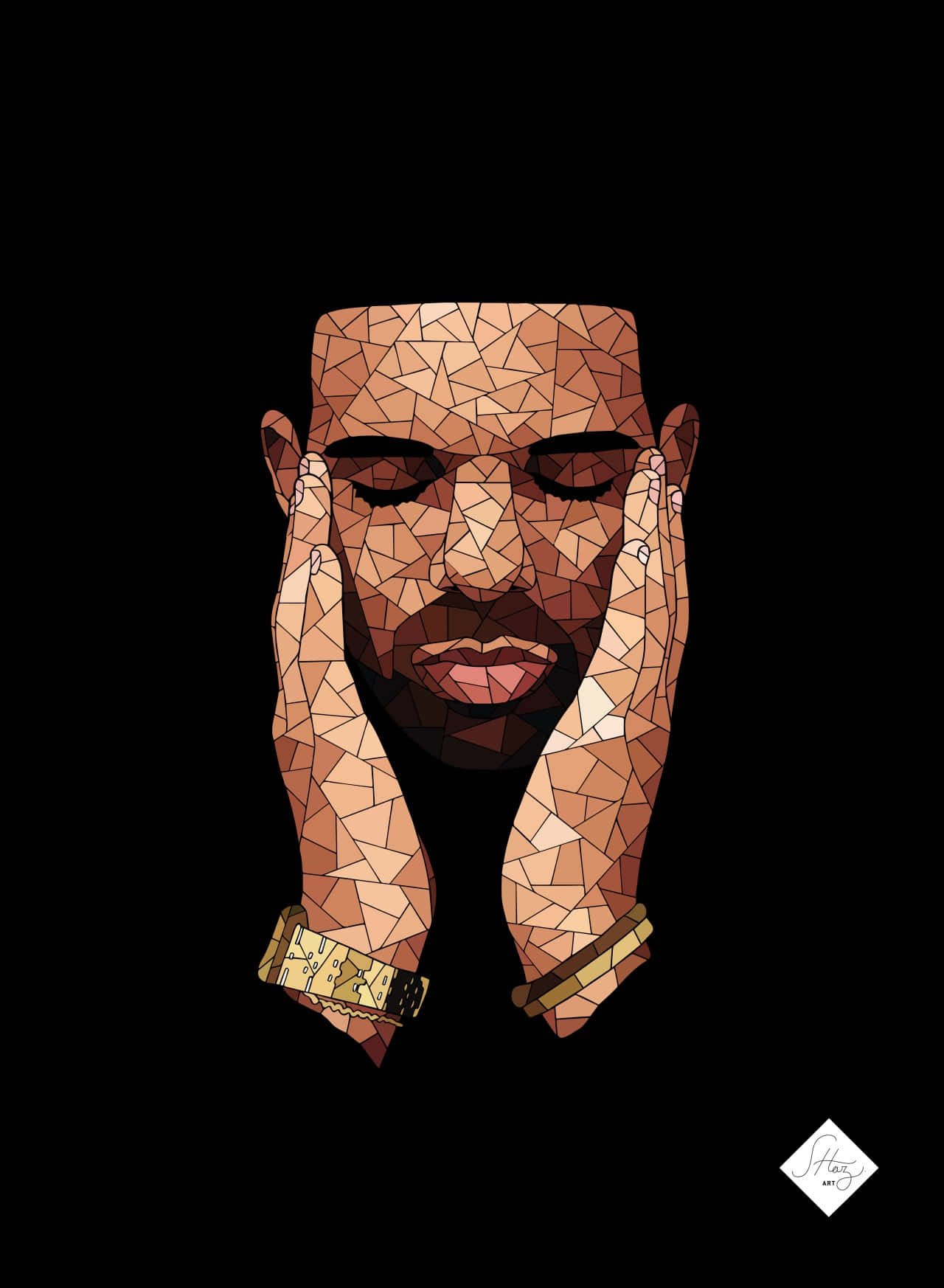
Drake is one of the most influential, Canadian rappers, singers, and songwriters to ever make waves in this industry. He came into the scene in the late 2000s with a wave of successful albums and awards and has even shaped the sonic sound of contemporary hip-hop, but, more impressively, its visual aesthetics. Any album’s cover art is one of the most important matters a record has to make an impression on its listeners. This essay will explore how Drake’s cover art changed over time and analyze the artistic elements of his album covers, their themes, and the messages that they carry about his identity and his artistry.
The Significance of Album Covers
Album covers are most often viewed as an integral part of the music experience. They serve purposes such as visualization of the themes of the album, capturing the attention, and even guiding an understanding of the character of the artist. Even in the digital world where people have all moved to stream their music from anywhere, the cover art is an integral part of the branding and marketing of the artistic work. In the case of artists such as Drake, it can shape public perception even as it can be emblematic of their work.
Early Career of Drake: So Far Gone and Thank Me Later
The first notable project of Drake was So Far Gone 2009, which is also characterized by a cover consistent with his contemplative style. Here, the close-up face of Drake characterizes the muted color and the soft focus on the entire thing. Such an intimate portrayal is in harmony with the themes vulnerable enough to share your personal struggles within an album. Putting one’s face at the very front established a connection with an audience, welcoming them into his world.
In the wake of the success of his mixtape So Far Gone, the rapper released his debut studio album, Thank Me Later, which also touched base on a change in visual presentation of his cover art.
Breakthrough: Take Care
Take Care, his 2011 sequel, is Drake’s coming-of-age project, commercially as well as artistically. Damien Hirst photographed the young Drake in a collage of images: the rose and heart near a skull. The bright colors set against mixed media create an almost surreal quality akin to the album’s themes of love, loss, and self-discovery.
Cover art for Take Care had been different with their emotional depth and complexity. It therefore symbolized the inner battle of Drake and the search for authenticity in a world that is extremely superficial. Symbolic elements within the work reach out to listeners to peel more into the meaning and, as such, promote a more intimate association with the album.
Evolution of Aesthetics: Nothing Was the Same and Views
Nothing Was the Same (2013) brings a new level of evolution to Drake’s visual identity. The album cover art shows Drake in childhood form, accompanied by a photo of himself today; the duality of images is the representation of the issues that surround growth and introspection. The maturity idea is set through the journey that turned him into an artist he is today.
Then, in 2016, Views, and he makes himself a staple in the popularity list as an icon of culture. The cover art picture has him atop the CN Tower in Toronto-a take of great pride for his hometown and reflective of his heritage in music. Using the cityscape in the background symbolizes connectivity to his roots and pride in being from Toronto. The image is deeply synonymous with Drake’s brand.
His album covers signify themes of identity, vulnerability, and personal growth. They actually portray visual narratives that complement the lyrical content of his music. Each of the covers marks a different stage in his career; it captures this evolution of his artistry and the complexities of his experience.
The theme of self is very prominent as Drake frequently places himself center frame within his covers, bringing forth the journey he has been on and the authenticity of his artistry. This would appeal to a listener connecting more so with the man and his narrative.
Emotional Vulnerability: All the covers of Drake are emotionally vulnerable, showing one’s introspection, personal struggles, relationships, and the pains of fame. Thus, his themes in lyrics would merge into visual pictures as part of this emotional depth associated with his work.
Collaborations with Artists
He has collaborated with many of the most incredibly talented artists and designers to celebrate some of the most iconic album covers ever. He has teamed with some of the most renowned visual artists, leading to some of the most visually stunning and conceptually rich works associated with his covers. One of the other ways artists elaborate on themes and ideas is through creating album covers.
The New Culture of Digital
While digital consumption is now the age, album presentations have actually changed dramatically. Because streaming sites prefer aesthetic appeal, album art works as a significant tool in marketing and branding. More than most artists, Drake has played this for his benefit in making his album covers a source of anticipation and hype over releases.
Another reason why the album covers appear today is because of social media. People post and comment on images on Instagram and Twitter, thus increasing its power and reach.
Conclusion
Drakes cover art have played a pivotal role as integral parts in his artistic identity, a reflection of how his career has sculptured the themes that touch the listener’s soul. From the pensive looks of So Far Gone to the beauteous imagery of Views, each has got its own story and narrative that complements the music it touches. Through his collaboration with talented artists and a keen understanding of visual culture, Drake has come a long way in creating a brand more than music, thus becoming a cultural icon in the process.


